A cleaner, more strategic way to tell the compliance story.
To comply with a non-disclosure agreement, certain details in this case study have been intentionally modified or generalized. This includes anonymizing organization names, adjusting labels, and substituting select domain-specific terminology. In some cases, terms such as “program” are used in place of specific compliance frameworks to preserve confidentiality, while maintaining the accuracy of the underlying concepts.
The structures, workflows, calculations, and decision-making logic shown reflect the real system and design challenges addressed.
Challenge
The original dashboard failed to tell a clear story about a customer’s compliance posture. Key signals were buried, context was missing, and users were left without a meaningful way to understand where they stood or what needed attention.
Objectives
Redesign the dashboard to better communicate real-time compliance posture
Leverage v2 design patterns while remaining compatible with the v1 platform
Improve usability through modular, interactive widgets
Reduce user confusion and manual work by surfacing key issues faster
Project Scope
Dashboard Redesign
Tools
Figma, Lucidchart, Jira, Confluence, JavaScript, HTML5, CSS3, VS Code, Chrome DevTools, Git, Bitbucket, Linux
Roles
Designer, Engineer, Project Manager, QA Lead, User Testing Facilitator
Duration
3 Months
Our Strategy
Identifying Functional Requirements
An executive provided a diagrammatic breakdown outlining the shortcomings of the current dashboard’s storytelling, along with a few early concepts of their own, including hand-drawn sketches. We used this material as a foundation to define new functional requirements, carefully mapping them against the existing dashboard’s structure and terminology.
This helped us identify gaps in clarity, overlap in metrics, and missed opportunities, such as the inability to click into data points to access drilldown reports.
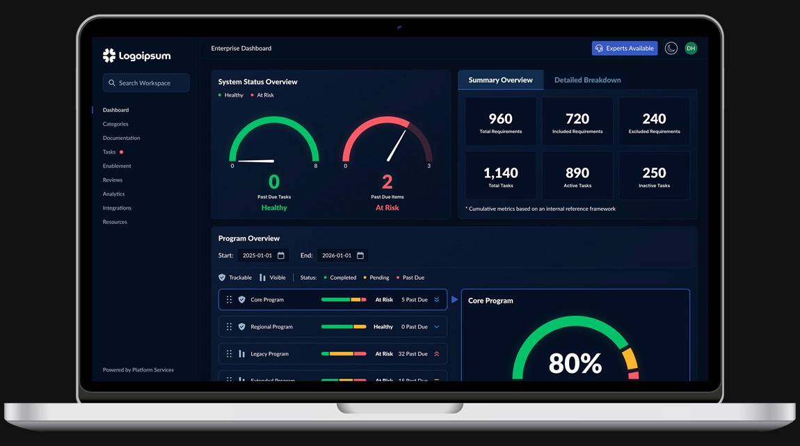
A Clearer View of Compliance
One idea from that documentation stood out immediately: a widget for managing active programs. The concept was simple but powerful. Users would see a list of programs they were actively tracked against, with visual progress bars representing their overall status. Below that, a secondary list would show other programs available for tracking, with the ability to activate them and reorder their priority.
This would let users tailor the dashboard to the programs most relevant to them while keeping the interface focused.
“Users should be able to quickly see how they’re doing against each program. What’s on time, what’s past due, and what needs attention. Keep it simple stupid.”
— Executive Stakeholder
Early sketches shown in this section have been anonymized to remove references to specific standards or organizations, while preserving the original structure and intent.
Designing a Better Story
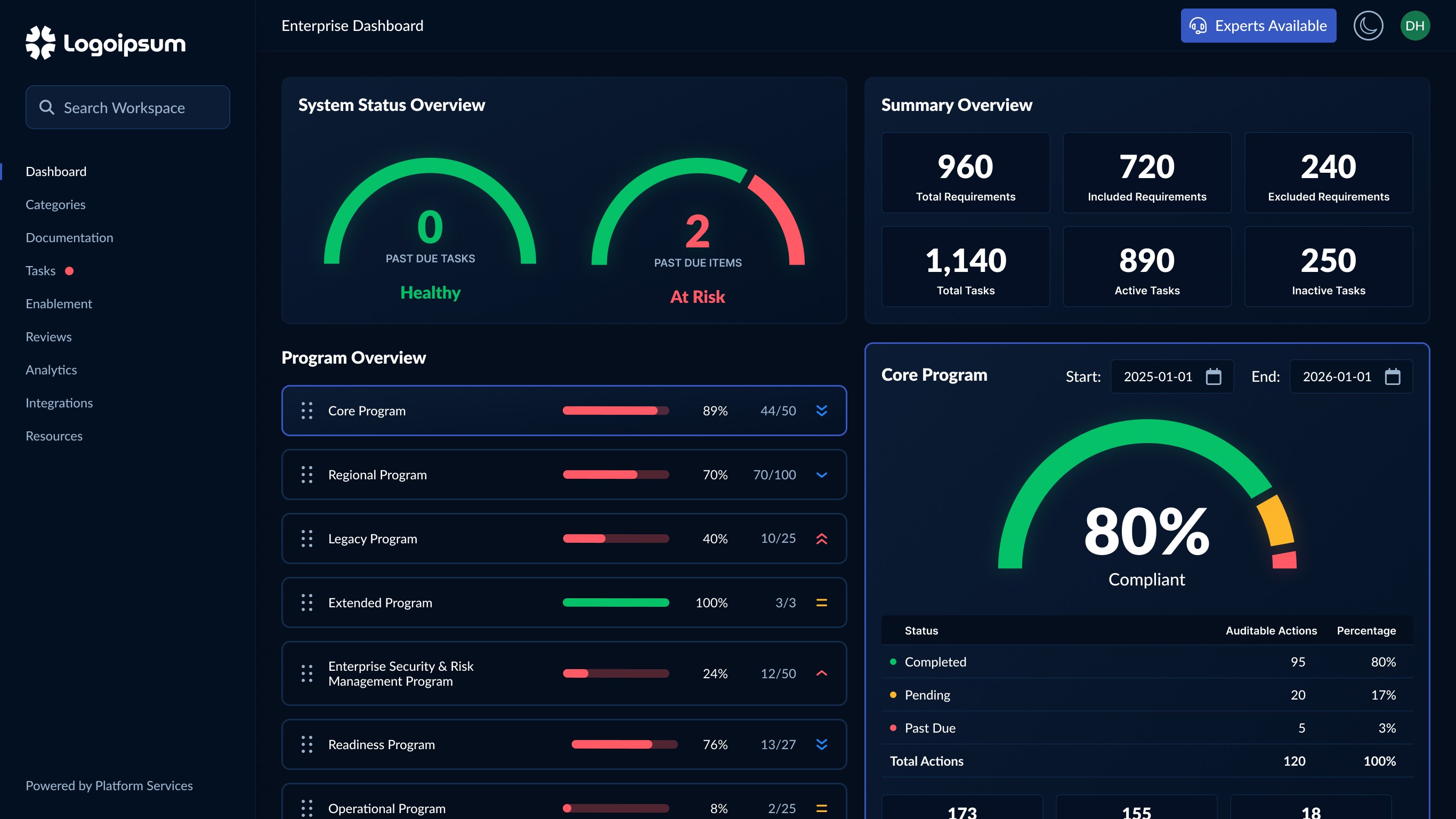
Using our v2 design language as a foundation, I created an early version of the redesigned dashboard in Figma. The layout introduced modular drag-and-drop cards, dynamic speedometers, and a cleaner visual hierarchy aimed at simplifying the compliance story. Priority icons were used to indicate the importance of each program, eliminating the need to separate them into two different lists.
This was an early concept that would later be refined through user testing and internal critique.
Building the Frontend
The dashboard was built using a lightweight frontend stack consisting of HTML, CSS, and vanilla JavaScript, bundled with Webpack and versioned through Git and Bitbucket. I accelerated development using prompt engineering, leveraging tools like Claude and ChatGPT to scaffold boilerplate code, explore implementation options, and reduce time on task. Throughout the process, I followed strict commit hygiene, referencing Jira tickets and writing descriptive messages focused on user value. Components were structured using semantic HTML and data attributes, allowing for seamless API integration as backend development progressed in parallel.
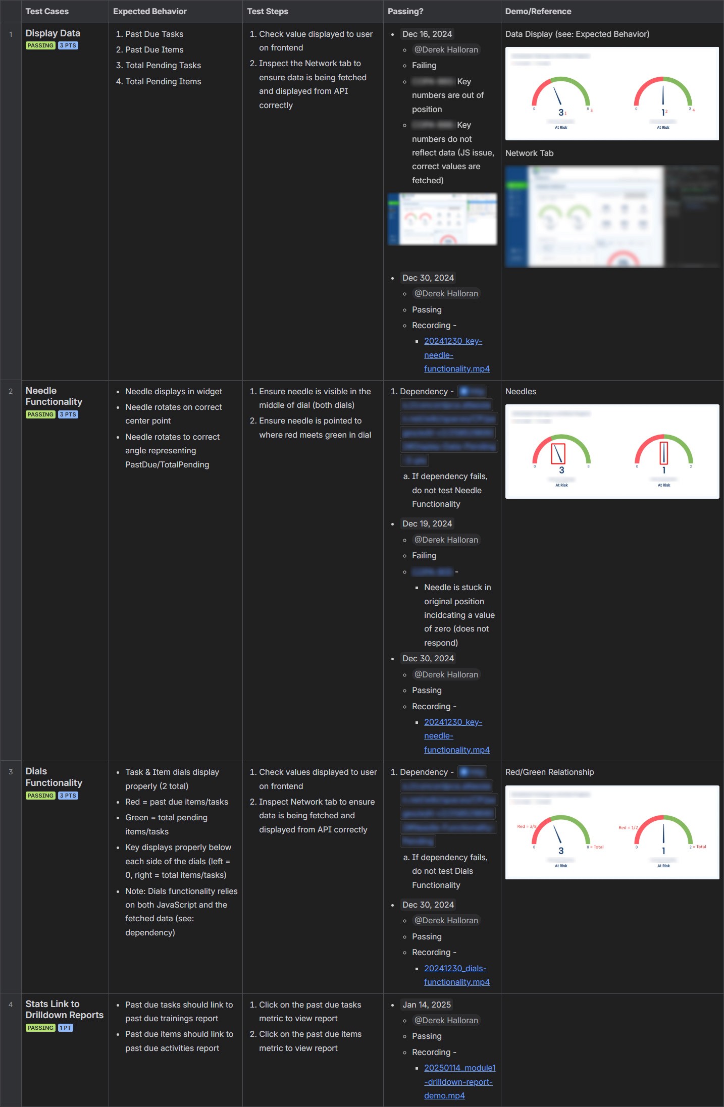
Speed-o-Meter Widget
One of the more advanced components was the speed-o-meter widget, which visualized the user's overall compliance posture for scheduled trainings and activities. Each dial was built from layered semicircles, red for incomplete and green for complete, with CSS controlling the stroke length based on a simple angle calculation: past due items divided by total items, multiplied by 180. I used the same angle to rotate the needle via CSS transforms, resulting in a clean, intuitive visualization of risk. This allowed users to quickly assess where their program stood without digging through raw tables or reports.
Animation shown with labels and contextual data removed to comply with NDA constraints.
A Critical Pause for Perspective
During a working session with the IT team, I spotted a contradiction in how color was being used across modules. That major inconsistency pointed to a larger issue in how the dashboard communicated compliance. I stepped back and wrote a detailed critique in Confluence to present to leadership, outlining areas where the experience fell short. Many of these issues had gone unnoticed because we were too close to the product. Internal alignment can create blind spots, making it even more critical to include user testing in future phases.
Inconsistent Use of Color
Color played a major role in the confusion. In the Speed-o-meters and Program Cards modules, green was used to indicate pending status. In the Program Details module, green instead represented completed status, and pending was reassigned to yellow. These shifts created conflicting visual cues, especially since green was used across the dashboard to represent two very different things. Our intention was to avoid penalizing the user for pending items and to show they were still in good standing. But while green often communicates health or completion in most systems, using it for open and incomplete items sent a mixed message. Without a consistent color language, users would be left unsure about what any given color meant, eroding trust in the dashboard’s clarity.
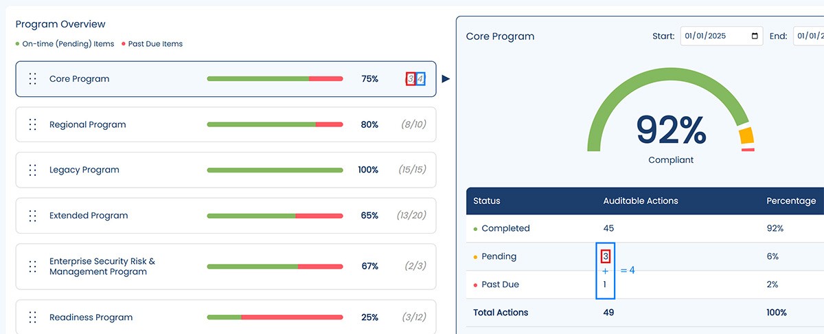
Mismatched Data Across Modules
One of the first issues I identified was a disconnect between the high-level compliance posture shown in the Speed-o-meters module and the detailed breakdowns in the Program Cards module. Due to overlap between frameworks, the number of past due items displayed in the Speed-o-meters module did not always match the totals shown in the program cards. For example, a user might see 4 activities marked as past due in a program card, yet only 2 reflected in the Speed-o-meters module. Similarly, the total number of pending items displayed in the speed-o-meter’s key metrics did not align with the sum of the denominators in the program cards. While this discrepancy was technically accurate, the logic behind it was not apparent to the user at first glance, which created unnecessary confusion and friction in interpreting their compliance status.
We also found inconsistency in how progress was visually communicated. In the Progress Cards module, bars filled from left to right starting with green to indicate healthy progress. In contrast, the Speed-o-meters module used red in the same direction, which could imply regression or risk rather than momentum. Our goal moving forward was to align progress visuals across modules using left-aligned green fill to create a more intuitive and consistent experience.
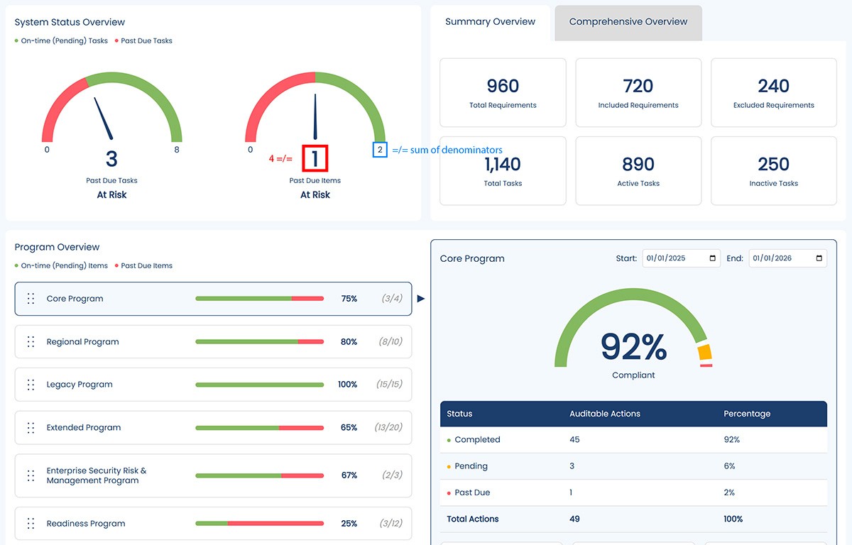
Misleading Percentages and Visual Cues
The Program Cards and Program Details modules both displayed percentages intended to reflect progress or compliance, but each used a different formula, and the interface didn’t make that distinction clear. The Program Cards module calculated what we referred to as “Program Percentage” using pending and past due items only, omitting completed items entirely. In contrast, the Program Details module introduced completed status and used it to calculate the actual compliance percentage. Without context or explanation, it was difficult for users to tell the difference between the two values or know which one they should rely on.
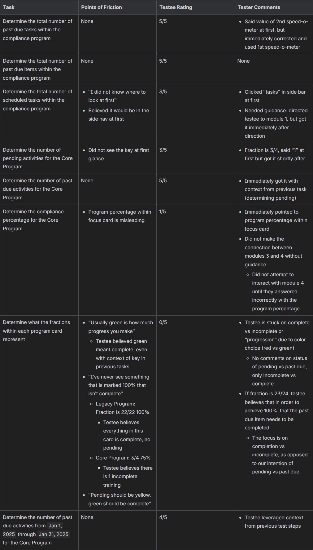
Understanding the User
To evaluate whether the dashboard supported real-world use, I designed a usability study centered on the Compliance Manager persona. Their primary goals were to identify anything past due, determine their level of compliance for programs they would be audited against within a specific time frame, and gain real-time insights.
Based on these expectations, I designed a task-driven usability study that reflected what a user would want to know within the first moments of landing on the dashboard. The focus was on assessing whether the interface clearly communicated risk, progress, and compliance status without requiring prior context or explanation.
Validating the Gaps
The results confirmed several critical issues identified during the initial design review.
First, users consistently misinterpreted green in the Program Cards module, believing it represented completed status rather than pending. This reinforced the earlier concern that color semantics were working against user expectations, even when supporting legends or labels were present.
Second, participants struggled to distinguish between progress-based metrics and actual compliance metrics. In particular, users defaulted to the most visually prominent percentage without understanding how it was calculated or how it differed from other values shown elsewhere in the interface. Without clear context, they relied on the wrong metric to answer compliance-related questions.
These findings validated the need to clarify visual language, simplify status signaling, and unify how compliance was communicated across modules. They also highlighted how easily technically accurate data can be misunderstood when visual cues conflict with established mental models.
Key Design Updates
After gathering feedback from usability testing and internal reviews, I returned to Figma to implement a series of focused design updates. The most pressing issues centered around color misinterpretation, confusion between compliance metrics, and a lack of clarity around what users were actually seeing. Compliance Managers needed to quickly identify past due items, assess risk by program, and understand their standing within a given time frame. Here are the key design changes that shaped the final version of the dashboard.
Simplifying the Speed-o-Meters
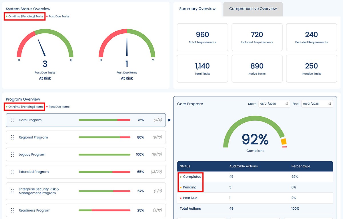
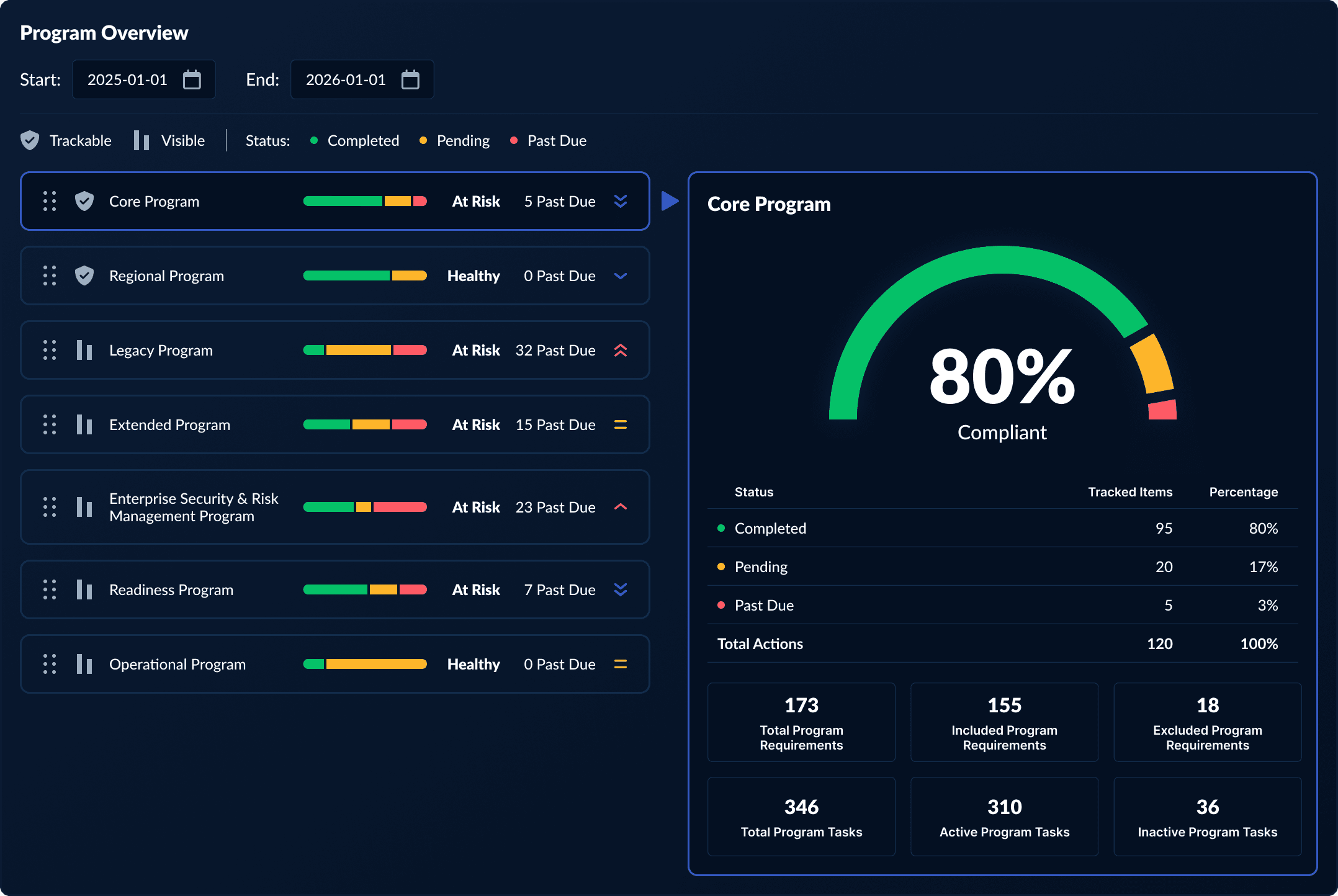
The Speed-o-meters module was simplified to eliminate ambiguity. Rather than showing progress visually, it now displays a single color: green if there are zero past due activities, and red if there is one or more.

Unifying Color Logic Across Modules
The progress bars in the Program Cards module were updated to mirror the compliance ring in the Program Details module. Both now use the same three-color system: green for completed, yellow for pending, and red for past due. This change established a shared visual language across the dashboard.
Replacing Program Percentage
To reduce confusion and bring focus to what mattered most, the “Program Percentage” was removed from the Program Cards module. In its place, we displayed the total number of past due activities per program and added a simple health reading to indicate whether a program was at risk or in good standing.
Connecting Program Cards and Details
To strengthen the connection between the Program Cards and Program Details modules, we placed them in a shared container and added a directional arrow to guide the user’s eye. The date pickers were also moved above a common divider, clarifying that the timeframe applied to both modules.
Enabling Drilldown Access Across the Dashboard
Every data point and metric in the dashboard now links to a corresponding drilldown report. This empowers users to take action, explore issues, and access the details behind every visual.
Updating Keys and Status Indicators
We refined or added keys across all modules to clearly define what each color represents. Green always means completed or healthy, yellow is pending, and red signals that something is past due or at risk. Icons were added to indicate whether a program was auditable or reportable.
Final Development Push
With the updated designs finalized in Figma, I organized the remaining development work into a structured Jira sprint. Tasks were created to mirror each design change, and I assigned and distributed the work across the team. I also archived all relevant documentation, including UX critique findings, test results, and design rationale, in our team’s Confluence library for future reference. This kept the sprint focused and transparent, allowing us to track progress and ensure every change aligned with the final mockups.
Launch & Outcome
We released the redesigned dashboard all at once, delivering a clearer, more actionable experience for Compliance Managers. Changes like removing the Program Percentage, simplifying color usage, and unifying layout structure made it easier to identify past due items, assess compliance by program, and access drilldown reports. Feedback was positive, and the dashboard established a scalable design language that set the foundation for our move to v2.
The Value of Perspective
This project reinforced the importance of testing, critique, and iterative design. It’s easy to get too close to a product and assume shared understanding within a team means clarity for the end user. Internal alignment is valuable, but without real user input, it can quickly turn into an echo chamber. Stepping back, validating assumptions, and making space for iteration turned a confusing experience into one that actually supported the people it was built for. Thank you for reading.