Jun 10, 2025
Designing the Efficient Frontier for Smarter Project Planning
As a UI/UX Software Engineer working cross-functionally with product and engineering teams, I often needed a better way to prioritize work. Too many ideas, not enough clarity. We needed something that brought structure to ambiguity, helping us decide what to build next and how long it would realistically take.
That’s why I adopted the Agile Effort Estimation Matrix, a method originally outlined by Michael Lant, which uses two input values to score tasks and forecast development effort. I was particularly drawn to the structured simplicity of this approach and adapted it to fit our business and project needs.
Inspired by the Efficient Frontier model from finance, which evaluates optimal risk versus reward scenarios, I named my version the Efficient Frontier Matrix to reflect a similar balance of effort versus value in product planning. As someone passionate about personal finance and investing, it felt like a natural conceptual bridge between two disciplines I care about.

What Is the Efficient Frontier Matrix?
This matrix scores each feature or process using two dimensions:
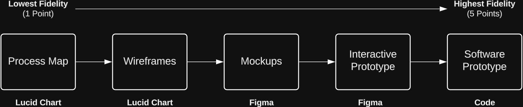
Fidelity Score (1–5)
How “finished” does the work need to be?
A 1 might be just a process map, while a 5 means a fully developed, coded feature.
Complexity Score (1–5)
How hard is it to build?
This includes technical depth, number of dependencies, and unknowns.
The result:
Fidelity Score × Complexity Score = Final Score (1–25)
Scoring helps teams understand not just the effort required, but also which features warrant deeper investment. High-value features that are core to the product experience or critical to the business should be taken to higher fidelities like interactive prototypes or fully coded implementations. These higher-fidelity outputs reduce uncertainty, validate decisions earlier, and ensure smoother handoff across teams.
However, increasing fidelity comes with increased time and resource costs. That is where opportunity cost becomes crucial: spending more time on one feature means less time for others. The matrix provides a way to visualize and weigh those trade-offs, ensuring that teams are investing their effort where it will create the most impact.
Estimating Timelines
Final scores are mapped to estimated durations using simple benchmarks:
Final Score (1-25) | Estimated Duration | Story Points |
|---|---|---|
Green (1-3) | 1-2 Days | 1 or 3 |
Lime Green (4-6) | 3 Days - 1 Week | 5 |
Yellow (8-12) | 1-2 Weeks | 8 |
Orange (15-20) | 3-4 Weeks | 13 |
Red (25) | Requires Jira Epic | 13+ |
These estimates feed directly into Gantt charts for sprint and release planning, helping transform subjective priorities into structured timelines.
A Versatile Framework
One of the key strengths of this matrix is how adaptable it is.
In a recent fast-paced project, I reused the same matrix but replaced the duration ranges with hours instead of days. I also adjusted the input dimensions to better fit the context: I was provided with over 180 wireframes from a business stakeholder, and my role was to standardize those experiences into a cohesive set of design templates in preparation for development handoff.
Interface Complexity (1–5)
How complex is the design layout and component structure?
Higher scores reflect wireframes that take more time to construct in Figma and are harder to standardize across the system due to custom components, intricate layouts, or inconsistent interaction patterns that require alignment across templates.
Variation within Template Group (1–5)
How much inconsistency exists within a group of related templates?
The 180+ templates were sorted into groups based on shared layouts, flows, or intended purpose. The score reflects the level of inconsistencies in structure, interaction patterns, or layout logic across the group. A 1 represents a highly uniform set of templates, while a 5 indicates a group with significant variation that requires consolidation or redesign.
By making these changes, we were able to apply the same scoring system while tailoring the timeline and input dimensions to fit the specific requirements of the project. This flexibility makes the framework suitable for both short-term sprints and long-term roadmaps.
Final Score (1-25) | Duration Range | Story Points |
|---|---|---|
1-3 | 0-1 Hours | 1 |
4-6 | 1-2 Hours | 2 |
8-12 | 2-4 Hours | 3 or 5 |
15-20 | 4-8 Hours | 8 |
25 | 8-16 Hours | 13 |
Why It Works
• Data-Driven Prioritization – Removes guesswork and bias
• Supports Iterative Delivery – Highlights low-effort, high-impact wins
• Visually Intuitive – Enhances communication with stakeholders
• Repeatable and Scalable – Easily adjusted for different projects and teams
Outcomes & Impact
Using this tool helped our team:
• Reach consensus faster on what to build
• Align timelines with actual effort
• Visualize scope across sprints and releases
• Convert raw ideas into clear, actionable plans
With just two scores, we created a shared language around complexity, value, and time that scales from individual features to full product roadmaps.