A cleaner, more strategic way to tell the compliance story.
Challenge
The original dashboard failed to tell a clear story about a customer’s compliance posture. Key signals were buried, context was missing, and users were left without a meaningful way to understand where they stood or what needed attention.
Objectives
Redesign the dashboard to better communicate real-time compliance posture
Leverage v2 design patterns while remaining compatible with the v1 platform
Improve usability through modular, interactive widgets
Reduce user confusion and manual work by surfacing key issues faster
Project Scope
Dashboard Redesign
Tools
Figma, Lucidchart, Jira, Confluence, JavaScript, HTML5, CSS3, VS Code, Chrome DevTools, Git, Bitbucket, Linux
Roles
Designer, Engineer, Project Manager, QA Lead, User Testing Facilitator
Duration
3 Months
Our Strategy
Identifying Functional Requirements
Our CEO provided a Lucidchart breakdown outlining the shortcomings of the current dashboard’s storytelling, along with a few early concepts of his own, including hand-drawn sketches. We used this material as a foundation to define new functional requirements, carefully mapping them against the existing dashboard’s structure and terminology. This helped us identify gaps in clarity, overlap in metrics, and missed opportunities, such as the inability to click into data points to access drilldown reports.
A Clearer View of Compliance
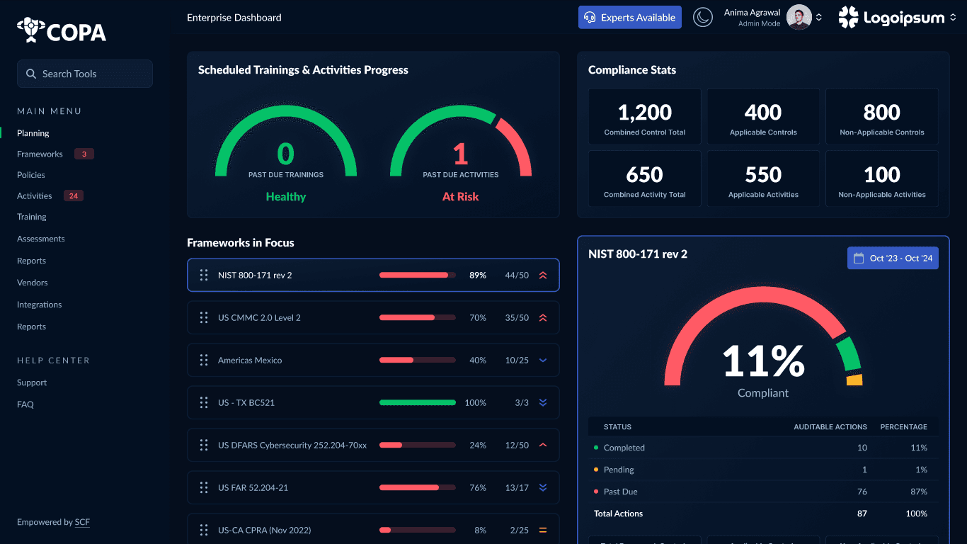
One idea from that document stood out immediately: a widget for managing active frameworks. The concept was simple but powerful. Users would see a list of frameworks they are actively audited or assessed against, with visual progress bars representing their compliance. Below that, a secondary list would show other frameworks available for tracking, with the ability to check a box to activate them and reorder their priority. This would let users tailor the dashboard to the frameworks most relevant to them while keeping the interface focused.
“Users should be able to quickly see how they’re doing against each framework. What’s on time, what’s past due, and what needs attention. Keep it simple stupid.”
— Jay Patterson, CEO at CCI

Designing a Better Story
Using our v2 design language as a foundation, I created an early version of the redesigned dashboard in Figma. The layout introduced modular drag-and-drop cards, dynamic speedometers, and a cleaner visual hierarchy aimed at simplifying the compliance story. Priority icons were used to indicate the importance of each framework, eliminating the need to separate them into two different lists.
This was an early concept that would later be refined through user testing and internal critique.
Project Management (first)
While designing, I also owned frontend development. I partnered with our backend developer to integrate data pipelines and implemented fully custom components for each dashboard widget. As project manager, I used Jira to forecast complexity, assign tickets, and track velocity. Our workflow included bug triage, staging reviews, and iteration cycles built around sprint checkpoints.
Frontend Development
Lorem - speed-o-meter below or module 3 and 4 interacting

User Acceptance Testing & UX Critique
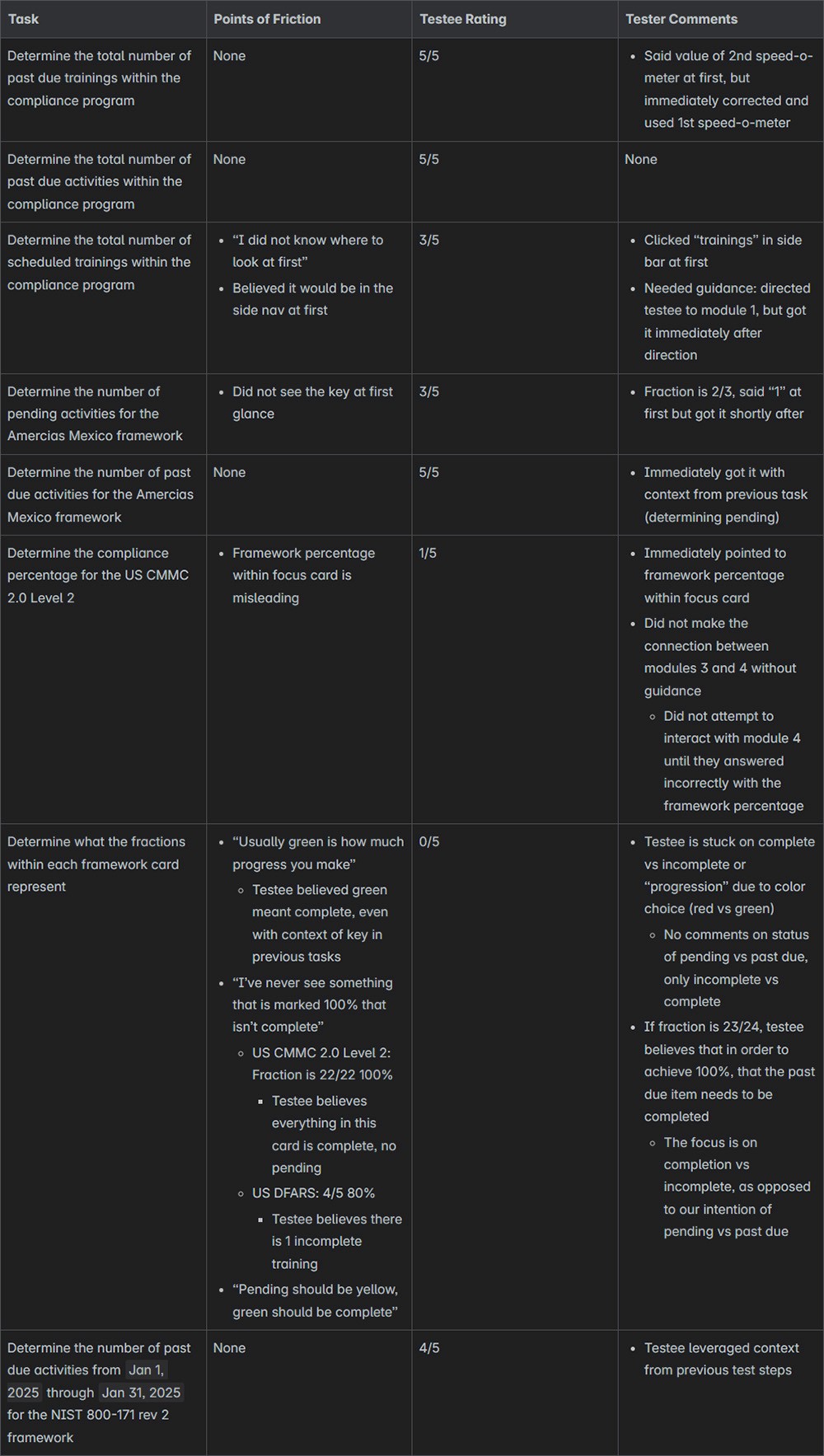
After staging the new experience, I ran an internal UX critique and quickly identified a deeper issue: the new dashboard still wasn’t telling a clear compliance story. Key metrics felt disconnected, and we were relying too much on visual flair rather than user comprehension. I wrote a UX critique outlining this and conducted user testing to validate the feedback. Results confirmed the need for another round of refinement.
Usability Testing
Lorem
focus on persona of compliance manager (see documents within reflection folder)
test results below as they also define what tasks were performed (then talk about why)
Rapid Design Refinement
Given the growing realization that we’d be on v1 longer than anticipated, I created a lightweight Figma library based on v1 styles. This enabled us to iterate quickly in the correct visual system and better align cross-team discussions. From there, we realigned each widget to more clearly represent risks, statuses, and next steps.
focusing on the story
Final Development Push
With updated designs in hand, I led the final development sprint and integrated the refined dashboard. These changes were heavily informed by our user testing results and internal feedback loops. We ensured pixel parity with the new Figma mockups and updated the test suite to reflect the latest widget logic.
Launch & Outcome
We rolled out the redesigned dashboard as part of a phased release. Compared to the original, the new experience offered clearer visual hierarchy, interactive elements, and a focused compliance narrative. Early feedback from power users was overwhelmingly positive, and support tickets related to dashboard confusion dropped significantly post-launch.
(before vs after comp below)
tbd
talk about how it's easy to get too close to something - importance of testing, referencing outside resources